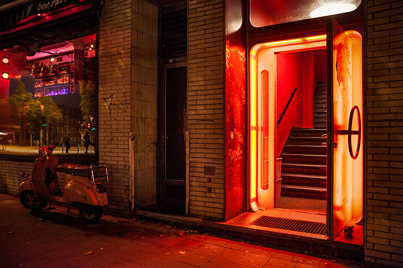
Applying the principles of color psychology in architecture is about taking advantage of this universal visual and visceral language, integrating it into building design to enhance and support a building’s message and function. Based on color theory, the right colors will elicit emotional responses that create a positive connection between us and our spaces.
Historically a controversial subject, color in architecture continues to evoke a spectrum of opinions. There has always been a segment of the profession that does not consider color an essential part of design strategy.
However, there is also a long list of exceptional architects of yesterday and today whose signature styles celebrate color as a fundamental element of design. Their extraordinary work speaks boldly and vividly for itself.

5 Famous Architects Show Their True Colors
Antoni Gaudi (1852 – 1926)
Barcelona is defined by the spirit of architect Anton Gaudi, one of the leaders of Catalan Modernism and Art Nouveau. His extraordinary works are the merging of traditional decorative stained glass, ceramics and wrought iron forging with unique, eccentric forms. Inspired by nature, mythology, and religion, Gaudi’s projects feature colorful polychromatic tile, brick and stonework. Casa Vicens, El Capricho, Casa Batllo, Park Guell and the Sagrada Familia are among his most famous masterpieces.
Luis Barragán (1902 – 1988)

Michael Graves (1934 – 2015)
Playful colors and bold forms define the work of Michael Graves, an American architect notorious for breaking away from traditional modernism. “I love Borromini and want to get some of the feeling of the richness of that architecture into my work, but if you have to paint it white and make it flat, what's the point?'' Nobody can argue that the colorful St Coletta school Washington DC, or the Swan and Dolphin Resort in Disneyworld is flat.
Theo Van Doesburg (1883 – 1931)
Dutch painter, writer, poet, and architect Theo Van Doesburg and founder of the journal De Stijl and architect, Theo Van Doesburg was a strong proponent of color in architect. As founder of the journal De Stijl, and one of the main proponents of the Neoplasticism architectural movement, Van Doesburg collaborated with other like-minded designers to create projects such as Café L”Aubette. The bold use of primary colors symbolized pure abstraction.
Richard Rogers (1933-)
Richard Rogers is a British architect known for his colorful, high tech, functionalist approach to design. It was the Centre Georges Pompidou that propelled him into the limelight. That giant rectangular mass of colorful pipes and scaffolding, is actually a carefully color-coded plan of the building, with blue for ventilation systems, green for plumbing and fire control piping, yellow and orange for electrical systems, red for elevator shafts and white for structure and large ventilation components.
As more and more architects of today embrace the significance of color psychology in architecture, tomorrow promises to be brighter and more colorful. Now that’s music to our eyes. Read more about color in architecture here.

